- Email info@itwebsols.com
- Phone +968 9285 4845
About Us
iTWebsols is a web solution provider in Web Designing and Development, Search Engine Optimization, Social Media, Paid Social, and PPC/ Google Ads services. We offer online marketing solutions to small and large-scale businesses globally.
Contact NowContact Info
- Muscat / Salalah - Oman
- +968 9285 4845
- info@itwebsols.com
- Sun - Thur (10.00 am - 7.00 pm)
Fri - Closed
Sat - (10.00 am - 2.00 pm)
Designing for Web and Mobile: Responsive and User-Centered Approaches
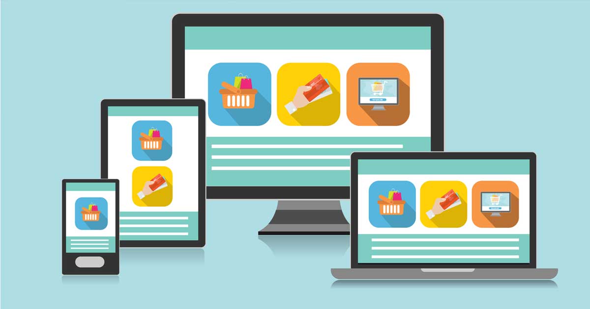
In today’s digital landscape, designing for web and mobile requires a strategic blend of responsive design and user-centered design principles. With the proliferation of various devices and screen sizes, it’s crucial to create designs that provide a seamless experience across all platforms. This guide explores the key concepts and best practices for developing responsive, user-centered web and mobile designs that enhance user engagement and satisfaction.
The Importance of Responsive Design
1. Adaptability Across Devices
Responsive design ensures your website or application looks and functions well on any device, whether it’s a desktop, tablet, or smartphone. This adaptability is achieved through flexible layouts, grids, and media queries that adjust to different screen sizes and orientations.
2. Improved User Experience
A responsive design provides a consistent and intuitive user experience, regardless of the device used. This consistency is crucial for retaining users and reducing bounce rates. When users can navigate your site or app effortlessly, they are more likely to stay longer and engage more deeply.
3. SEO Benefits
Search engines like Google prioritize mobile-friendly websites in their search results. By implementing responsive design, you improve your site’s SEO performance, making it easier for users to find you through search engines. This can lead to increased traffic and higher conversion rates.
Principles of User-Centered Design
1. Understanding User Needs
User-centered design (UCD) starts with a deep understanding of your target audience. Conduct user research through surveys, interviews, and usability testing to gather insights into user behaviors, preferences, and pain points. This data forms the foundation of your design decisions.
2. Prioritizing Usability
Usability is a core component of UCD. Your design should be intuitive, easy to navigate, and accessible to all users. Implementing clear navigation, readable fonts, and concise content helps users accomplish their tasks efficiently.
3. Iterative Design Process
UCD involves an iterative design process, where you continuously test and refine your designs based on user feedback. This approach ensures that your final product meets user needs and expectations. Regularly updating your design based on real user input helps keep it relevant and effective.
Best Practices for Responsive and User-Centered Design
1. Flexible Grid Layouts
Use flexible grid layouts to create a design that can adapt to different screen sizes. Grid systems help maintain a balanced and organized layout, ensuring that elements resize proportionally and maintain their structure across devices.
2. Scalable Images and Media
Optimize images and media for different devices by using scalable formats. Implementing CSS techniques like responsive images (using srcset and sizes attributes) ensures that your visuals load quickly and look sharp on all screens.
3. Mobile-First Design
Adopt a mobile-first approach, designing for smaller screens first and then scaling up for larger screens. This strategy helps prioritize essential content and functionality, ensuring that your design remains effective on mobile devices where space is limited.
4. Touch-Friendly Interfaces
Design interfaces that are touch-friendly, with appropriately sized buttons and interactive elements. Ensure that touch targets are large enough to be easily tapped, and incorporate gestures like swiping and pinching to enhance the mobile experience.
5. Consistent Navigation
Maintain consistent navigation across all platforms to provide a familiar user experience. Use responsive navigation patterns, such as hamburger menus or collapsible sections, to keep navigation intuitive and accessible on smaller screens.
6. Performance Optimization
Optimize performance to ensure fast loading times, especially on mobile networks. Minimize the use of heavy scripts and large files, and leverage techniques like lazy loading for images and content. A fast, responsive site enhances user satisfaction and engagement.
7. Accessible Design
Incorporate accessibility best practices to ensure your design is usable by everyone, including people with disabilities. Use semantic HTML, provide alternative text for images, and ensure sufficient color contrast. Accessible design is not only ethical but also expands your potential audience.
Tools and Frameworks for Responsive Design
1. Bootstrap
Bootstrap is a popular front-end framework that simplifies the creation of responsive designs. It provides a robust grid system, pre-styled components, and utilities that make it easy to build responsive layouts quickly.
2. Flexbox and CSS Grid
CSS Flexbox and Grid Layout are powerful tools for creating flexible and responsive layouts. Flexbox excels in distributing space along a single axis, while CSS Grid allows for more complex, two-dimensional layouts. Both are essential for modern responsive design.
3. Media Queries
Media queries are a cornerstone of responsive design, allowing you to apply different styles based on the device’s characteristics, such as screen width, height, orientation, and resolution. They enable you to fine-tune your design for various devices.
Conclusion
Designing for web and mobile involves a delicate balance of responsive design and user-centered design principles. By focusing on adaptability, usability, and performance, you can create engaging and accessible experiences for all users. Implementing flexible grid layouts, scalable media, mobile-first strategies, and touch-friendly interfaces ensures that your design performs well across all devices. Additionally, prioritizing user needs and accessibility enhances satisfaction and broadens your audience reach.
By following these best practices and leveraging the right tools and frameworks, you can master the art of creating responsive, user-centered web and mobile designs that stand out in today’s competitive digital landscape.