- Email info@itwebsols.com
- Phone +968 9285 4845
About Us
iTWebsols is a web solution provider in Web Designing and Development, Search Engine Optimization, Social Media, Paid Social, and PPC/ Google Ads services. We offer online marketing solutions to small and large-scale businesses globally.
Contact NowContact Info
- Muscat / Salalah - Oman
- +968 9285 4845
- info@itwebsols.com
- Sun - Thur (10.00 am - 7.00 pm)
Fri - Closed
Sat - (10.00 am - 2.00 pm)
Visual Hierarchy in Graphic Design: Guiding the Viewer’s Eye
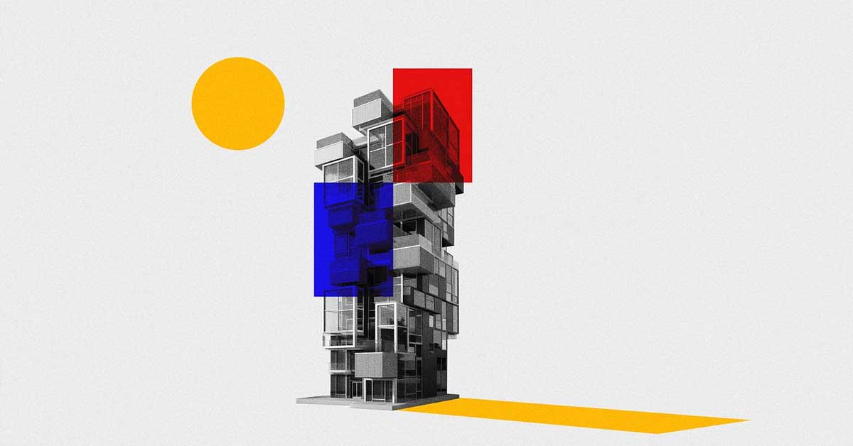
In the realm of graphic design, visual hierarchy is a fundamental concept that plays a pivotal role in guiding the viewer’s eye through a composition. By effectively organizing and prioritizing elements, designers can control the flow of information, ensuring that the most critical messages are seen and understood first. Here’s an in-depth look at how to create and utilize visual hierarchy in graphic design to enhance user engagement and communication.
The Importance of Visual Hierarchy
Visual hierarchy is essential because it dictates the order in which the human eye perceives what it sees. This order affects how well a viewer understands the message and can significantly influence their actions, such as making a purchase or engaging with content.
Key Elements of Visual Hierarchy
To create a compelling visual hierarchy, designers use several key elements:
- Size and Scale
- Larger Elements: Elements that are larger are often perceived as more important. Headlines, for instance, are usually larger than body text to draw attention first.
- Proportional Scaling: Use proportional scaling to create a sense of balance and emphasis where needed.
- Color and Contrast
- Bold Colors: Use bold and vibrant colors to highlight important elements such as call-to-action buttons.
- High Contrast: Employ high contrast between elements to make key features stand out, improving readability and focus.
- Typography
- Font Size and Weight: Varying the size and weight of fonts helps distinguish different levels of importance. Headlines might use a bold, large font, while subheadings and body text use smaller, lighter fonts.
- Font Style: Different fonts can evoke different emotions and guide the viewer’s perception of the content.
- Spacing and Proximity
- White Space: Adequate white space prevents clutter and makes the design more readable and visually appealing.
- Grouping Related Elements: Elements that are related should be placed close to each other, which helps the viewer understand their connection quickly.
- Alignment
- Consistent Alignment: Ensuring that text and other elements are properly aligned creates a clean and professional look, making it easier for the viewer to navigate through the content.
- Grid Systems: Utilizing grid systems helps in maintaining consistent alignment and spacing throughout the design.
- Visual Cues
- Arrows and Lines: Visual cues such as arrows and lines can direct the viewer’s attention to specific areas of the design.
- Icons and Imagery: Using icons and images effectively can draw attention and convey information quickly.
Practical Applications of Visual Hierarchy
- Web Design
- Homepage Layout: The homepage should use a clear visual hierarchy to guide users from the headline to the call-to-action buttons seamlessly.
- Navigation Menus: Menus should be designed with visual hierarchy in mind to ensure users can easily find what they’re looking for.
- Print Media
- Brochures and Flyers: Important information should be highlighted through size, color, and placement to ensure it catches the reader’s eye first.
- Posters: Utilize large, bold headlines and strategic imagery to convey the main message quickly.
- Mobile Design
- Responsive Design: Ensure that visual hierarchy is maintained across different screen sizes, with key elements remaining prominent.
- Touch Targets: Make sure that buttons and interactive elements are easily accessible and stand out.
Best Practices for Implementing Visual Hierarchy
- Consistency is Key
- Maintain a consistent style throughout the design to avoid confusion and ensure a smooth visual flow.
- User Testing
- Conduct user testing to see how real users interact with your design and make adjustments based on their feedback.
- Iterate and Improve
- Continuously iterate on your design, making improvements to enhance the visual hierarchy and overall user experience.
Conclusion
Mastering visual hierarchy in graphic design is crucial for creating designs that are not only aesthetically pleasing but also effective in conveying the intended message. By strategically using size, color, typography, spacing, alignment, and visual cues, designers can guide the viewer’s eye and improve the overall usability of their designs. Implement these principles to create compelling designs that capture attention and communicate your message clearly and effectively.